Creación de un Login Form II: Dándole estilo al formulario
Partiendo del anterior post donde creamos nuestro formulario con HTML, ahora queremos darle algo de estilos y mejorar la percepción del usuario al ver nuestro formulario.
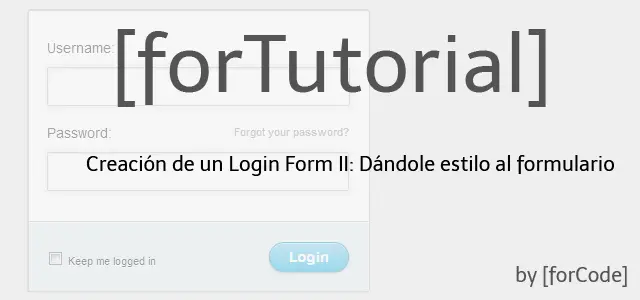
Partiendo del anterior post donde creamos nuestro formulario con HTML, en este presente post; os proporcionamos unos CSS para que podáis maquetar y ajustar vuestro formulario según vuestra idea de diseño.
Situémonos
Como habréis visto en la cabecera del HTML anterior, os hicimos spoiler de lo que vendrán en los siguientes pasos. Hoy, os compartimos el fichero styles.css, que nos permitirá dar colorido a nuestra estructura HTML, y posicionar los elementos donde queremos.
<head>
  <!-- ... -->
  <!-- CSS -->
  <link rel="stylesheet" href="css/styles.css" />
  <!-- ... -->
</head>
Fichero style.css
Este es el fichero que hace gran parte de la magia. En él, podemos ver varias técnicas de CSS como:
- Modificar el estilos de un mismo elemento nativo del DOM. Por ejemplo: Todos los inputs:
input[type=name]. - Aplicar CSS según su id asignado. Por ejemplo:
#containero#lower. - Usar las classes de CSS para poder reutilizar código. Por ejemplo:
.check. - También podemos ver ejemplos de aplicar CSS según estados/acciones de nuestros elementos:
:focuso:active.
Os aninamos a leer el siguiente código CSS, analizarlo, jugar con él, romperlo... Solamente así podréis aprender y entender qué hace cada una de las líneas que contiene.
/* Stylesheet */

/*
    author: forCode
    url: www.forcode.es
*/

/* Imports */

@import url(animate.css);

/* Selections */

::selection {
    color: #fff;
    text-shadow: none;
    background: #444;
}

::-moz-selection {
    color: #fff;
    text-shadow: none;
    background: #444;
}

/* Basics */

html, body {
    width: 100%;
    height: 100%;
    font-family: "Helvetica Neue", Helvetica, sans-serif;
    color: #444;
    -webkit-font-smoothing: antialiased;
    background: #f0f0f0;

}

#container {
    position: fixed;
    width: 340px;
    height: 280px;
    top: 50%;
    left: 50%;
    margin-top: -140px;
    margin-left: -170px;
    background: #fff;
    border-radius: 3px;
    border: 1px solid #ccc;
    box-shadow: 0 1px 2px rgba(0, 0, 0, .1);
    -webkit-animation-name: bounceIn;
    -webkit-animation-fill-mode: both;
    -webkit-animation-duration: 1s;
    -webkit-animation-iteration-count: 1;
    -webkit-animation-timing-function: linear;
    -moz-animation-name: bounceIn;
    -moz-animation-fill-mode: both;
    -moz-animation-duration: 1s;
    -moz-animation-iteration-count: 1;
    -moz-animation-timing-function: linear;
    animation-name: bounceIn;
    animation-fill-mode: both;
    animation-duration: 1s;
    animation-iteration-count: 1;
    animation-timing-function: linear;
}

form {
    margin: 0 auto;
    margin-top: 20px;
}

label {
    color: #555;
    display: inline-block;
    margin-left: 18px;
    padding-top: 10px;
    font-size: 14px;
}

p a {
    font-size: 11px;
    color: #aaa;
    float: right;
    margin-top: -13px;
    margin-right: 20px;
    -webkit-transition: all .4s ease;
    -moz-transition: all .4s ease;
    transition: all .4s ease;
}

p a:hover {
    color: #555;
}

input {
    font-family: "Helvetica Neue", Helvetica, sans-serif;
    font-size: 12px;
    outline: none;
}

input[type=name],
input[type=password] {
    color: #777;
    padding-left: 10px;
    margin: 10px;
    margin-top: 12px;
    margin-left: 18px;
    width: 290px;
    height: 35px;
    border: 1px solid #c7d0d2;
    border-radius: 2px;
    box-shadow: inset 0 1.5px 3px rgba(190, 190, 190, .4), 0 0 0 5px #f5f7f8;
    -webkit-transition: all .4s ease;
    -moz-transition: all .4s ease;
    transition: all .4s ease;
}

input[type=name]:hover,
input[type=password]:hover {
    border: 1px solid #b6bfc0;
    box-shadow: inset 0 1.5px 3px rgba(190, 190, 190, .7), 0 0 0 5px #f5f7f8;
}

input[type=name]:focus,
input[type=password]:focus {
    border: 1px solid #a8c9e4;
    box-shadow: inset 0 1.5px 3px rgba(190, 190, 190, .4), 0 0 0 5px #e6f2f9;
}

#lower {
    background: #ecf2f5;
    width: 100%;
    height: 69px;
    margin-top: 20px;
    box-shadow: inset 0 1px 1px #fff;
    border-top: 1px solid #ccc;
    border-bottom-right-radius: 3px;
    border-bottom-left-radius: 3px;
}

input[type=checkbox] {
    margin-left: 20px;
    margin-top: 30px;
}

.check {
    margin-left: 3px;
    font-size: 11px;
    color: #444;
    text-shadow: 0 1px 0 #fff;
}

input[type=submit] {
    float: right;
    margin-right: 20px;
    margin-top: 20px;
    width: 80px;
    height: 30px;
    font-size: 14px;
    font-weight: bold;
    color: #fff;
    background-image: -webkit-gradient(linear, left top, left bottom, from(#acd6ef), to(#6ec2e8));
    background-image: -moz-linear-gradient(top left 90deg, #acd6ef 0%, #6ec2e8 100%);
    background-image: linear-gradient(top left 90deg, #acd6ef 0%, #6ec2e8 100%);
    border-radius: 30px;
    border: 1px solid #66add6;
    box-shadow: 0 1px 2px rgba(0, 0, 0, .3), inset 0 1px 0 rgba(255, 255, 255, .5);
    cursor: pointer;
}

input[type=submit]:hover {
    background-image: -webkit-gradient(linear, left top, left bottom, from(#b6e2ff), to(#6ec2e8));
    background-image: -moz-linear-gradient(top left 90deg, #b6e2ff 0%, #6ec2e8 100%);
    background-image: linear-gradient(top left 90deg, #b6e2ff 0%, #6ec2e8 100%);
}

input[type=submit]:active {
    background-image: -webkit-gradient(linear, left top, left bottom, from(#6ec2e8), to(#b6e2ff));
    background-image: -moz-linear-gradient(top left 90deg, #6ec2e8 0%, #b6e2ff 100%);
    background-image: linear-gradient(top left 90deg, #6ec2e8 0%, #b6e2ff 100%);
}
Esto es todo por hoy, no dduéis en preguntar si tenéis cualquier duda o propuesta de mejora; os responderemos tan pronto como sea posible. En el próximo post, os haremos llegar el fichero reset.css, para resetear las CSS de los elementos del HTML que nos añaden de manera nativa todos los navegadores.
Creación de un Login Form
- 1. Creación de un Login Form I: Código HTML
- 2. Creación de un Login Form II: Dándole estilo al formulario
- 3. Creación de un Login Form III: Reseteando estilos
- 4. Creación de un Login Form IV: Animando los estilos